Feedback welcome 

Where you have the name of the ship (on the left above the ship stats), would it be worth having a field after the name to display the description you have entered ?
(such a long field with so little text)
for example, In ship design screen:
Name: F1_Carrier
Description: Carrier equipped with Long range Weapons and 3 flight decks for max of 64 fighters
So when it comes to the design screen you would see:
F1_Carrier - Carrier equipped with Long range Weapons and 3 flight decks for max of 64 fighters
Granted the UI is a work in progress, at this point it seems disorganised (mind you it could be just me). Maybe a box around each group to help visually separate the various groups ?
In the ship stats box, would it be possible to have the numbers closer to the description ?
ie Hull 800
I would imagine as the screen gets wider the gap gets bigger.
While its not feedback on the current outlay, are you considering enabling a “load/Save Formation” button ?
(ie select group of ships and select save formation. Useful for rapidly deploying groups of ships with preset orders)
True, I need to find somewhere to put that description field in, maybe at the bottom of the screen along with the module breakdown. I also have a real nightmare with these semi-transparent windows when they overlay each other in certain circumstances, so I’m going to look at changing that to a different palette.
What specifically seems disorganised?
I suspect the arrangement of buttons and readouts at the top left could be better, to more clearly group the ship design stuff together?
Pretty much - yes.
When I look at the layout, its just comes across as busy. There is so much detail to take in. I was thinking of something that could separate the areas into their various functions.
For example:
Mission: Includes Difficulty, Resources, Briefing etc
Fleet: Race Selection, Design Ship, Existing Designs, Ship Categories
Ship: Information relating to the specific Ship
Case in Point

I agree, I may re-jig it more. I currently have this…

But it becomes a disaster when shown at minimum res (1280x768). I may need to tweak that screen

Heheh. In that case I am doomed. My computer can only support resolutions up to 1024 :\
Weird suggestion. What about grouping things in tabs?
(Think multiple spreadsheets)
You have multiple tabs running down the side and when you click on them they slide out . . .
Actually a bit of resizing for lower resolutions and I get this which isn’t ideal but LOTS better I had to ditch the design description but you can get it with a mouseover tooltip of a design anyway

ok so let me summarizes this just so i understand where we all are
the screen is mostly okay but the option in the upper left are clustered, and we lack a box for description.
additionally the screen does not scale down very well
assuming i am correct here is my suggestions, with visual aids because i have no idea to explain it without them.
click to open in new window
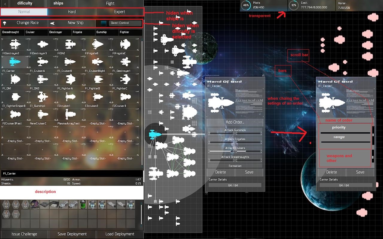
this is just a quick edit (thats happening a lot these days isn’t it) and the top left is not necessarily to scale
( we wouldn’t just leave a black space when you clicked the other tab)
also think that we could make the direct control bution prettier (no blue square it just stick out)
also about the tabs, the selection screen for the ships is always present the only thing that dispers is the new race, new ship, and direct control buttons.
in the order editing window me might change the deleted to cancel
about the Res. thats a decently large resolution, what if we decrease the font size just a little bit?
additionally it didn’t edit it because it was difficult (and i forgot at the time) the shooting arc of weapons confuse me, could we not ad like a black line or something at either end of the arc so we no where that weapons limits are, and if it 360 we do nothing or just have a faint-ish text saying 360 degrees inside the arc
Couple of small, quick points:
To me, the Direct Control button should be alongside the difficulty buttons (all options setting parameters for the battle to be fought, rather than directly influencing the deployment). Possibly the Change Race/New Ship buttons would go in a row with the ship class selection buttons (assuming it can be done in a way that is still readable).
I agree with dafrandle’s positioning of the Pilots/Cost/Honor fields to the upper right/ I also like the percentage “wheels” for Pilots and Cost.
I also like Darkstar’s addition of the lighted bars between sections. It gives the left side of the screen a little more structure, which I feel it needs at the expanded width it’s currently got.
