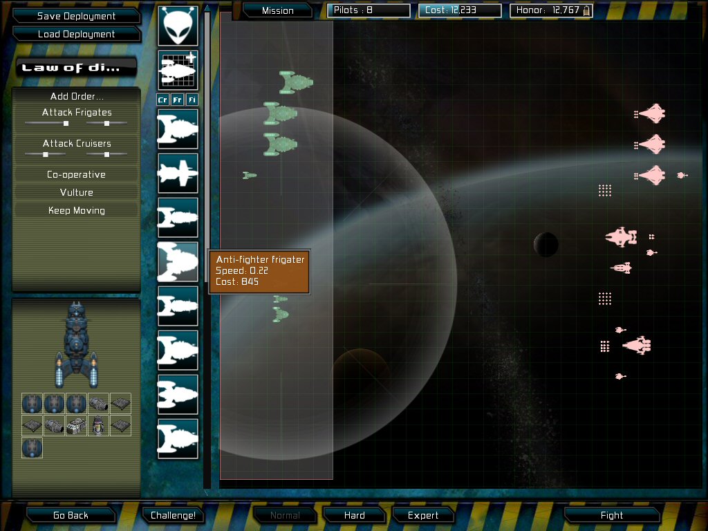
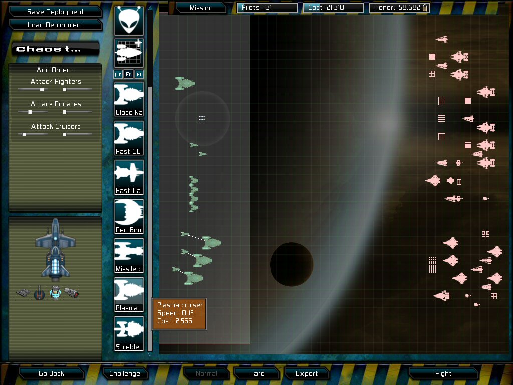
The post on the size and role of ships in the game got me to thinking that whether or not we re-classify big Frigates as DDs or add BBs or whatever, one thing that struck me during my most recent run through the stock challenges in the game is the ship icons in the fleet deployment screen aren’t to scale, making it hard to differentiate between FRGs and Cruisers, and even fighters sometimes aren’t obviously fighters.
If scale can’t be used to show what the hulls are by size inside the box, maybe there’s another kind of visual identifier that can help make the different classes clearer.
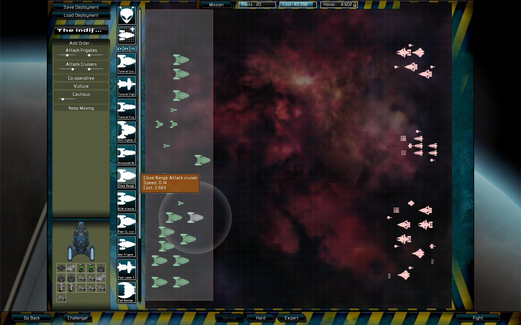
And slightly off my own topic, do we now have a way to tell what ship class has been selected during deployment? I seem to remember being annoyed at having to re-choose the ship type when faced with three or more identical hulls, and/or being annoyed by having to remember “it’s the second one down from the top of that group of three cruisers with the whatchamacallit flange-y dinguses coming out the side.”
I always thought this was on purpose to simulate the variation of ship designs…
Smaller cruisers for example as light cruisers, while bigger ones as battle cruisers. Large fighters are more like corvettes, while small frigates are more like destroyers, etc. The category of “frigate” in this game is so broad, that I think there should be more overlap not less. I wouldn’t mind putting a cruiser weapon on a frigate, for example, if you can somehow handle the weight and power and crew requirements…
Mr. Nova, your post has almost nothing to do with my original post. I’m just talking about the relative size of the ship icons in the little boxes on the left of the fleet deployment screen. Maybe you should consider moving your post to another thread, like the one about ship tonnage and role.
Hmm - please make them high contrasting colours. Colour blind here and I for one cannot use the pie charts.
And along that note - what if we could give each design a 6 Letter abbrev so in deployment the Icons in addition to having the basic white (or coloured…) silhouette would have your 6 digits superimposed. So you could tell that the Fenrir cruiser is also MMW-L or FM-L - designation for me is a Fenrir cruiser with either Multiple missiles or Fast missiles and the - L is light for well - light cruiser.
That way less hunting and picking.
Simple UI update… Really wouldn’t have to much to do with gameplay.
Sorry about that. I had mistaken the content of your post, thinking you were asking for more differentiation in classes for the hulls in the ship editor.
Anything that improves the “selecting ships” part of the deployment UI sounds like a good idea to me. At the moment, I am periodically deleting all my ships just to keep those deployment lists small and workable.
That’s a great idea too. As someone who can see colours, the tought never occured to me. I suppose having three different brightnesses (and colours) would solve the issue.
I can see the differences in the pie chart - the greens and browns and reds. What I cannot do is match them to the corresponding colours that explains what they are. I have found you can hover your mouse and then you get an explanation of what each slice represents. GSB isn’t bad - any turn based game isn’t bad. FPS games are getting trickier as the colour palettes are getting more and more realistic. Playing BF2 I have my nose glued to the screen looking for motion. I have spent full clips trying to take down a single tree at times.
Modern FPSs don’t get more realistic. They get more greybrown, which is not realistic at all. The house across the stree is red. I live in a blue one. Clothes are very colourful, so are glasses, backpacks, bags, cars, computers and nearly anything else we use. I hate the greybrown trend. It just tells me that the artists have not thought about how this could possibly look awesome, but were mostly concerned about their stuff blending in. As for BF2: That can be solved by playing better games Anything by Valve and Blizzard tends to not be greybrown (and Diablo 2 was, despite some insane claims, a rainbow colour fest).
The next GSB fleet is very colorful, if that helps?
I agree that some tweaking of those icons is needed so we can tell one ship variant from another. I will hopefully get around to this soon. I have encountered this a lot in the campaign game playtesting, where I now have many different fed cruisers I’m picking between, and they all obviously look very similar. It is a real pain.
I suspect having the first few letters of their name written in the icon would be the simplest and easiest way. I also like the idea of color coding by class, but extreme primary colros look bad, and subtle pastel colros tend to look a bit too cuddly.
Anyway, I’m thinking about this stuff right now. I’ll get sod-all done this weekend because family are visiting though. Bah.
I am not sure about using the first few letters of the ship name. For me in order to keep my designs orderly I give them very task oriented names.
Cruiser Missile -Fast
Cruiser Missile -MW
Twin Cruiser Multi-Purpose
Twin Cruiser Plasma
Etc - this keeps them in order when searching etc. All the missile cruisers are in one block, and divides them by number of engines (so all the speeds are the same) size, type, and mods.
I think an optional small name form for each class that shows up.
Of course I could just be being a little selfish here.
I like it, but don’t like where you’re selecting the text from. I’d like to have a 6-9 character “designation” field, where I can put this text in seperate from the ship name.
Here is how I name my ships:
Tribe Cruiser Freedom AF MK1
Tribe Cruiser Freedom AF SL MK1
Tribe Cruiser Freedom BL MK1
Tribe Cruiser Freedom BL SL MK1
Tribe Cruiser Freedom BL SL MK2
That would make me move weapons from the end to the front and I couldn’t designate race effectively (german naming convention - I am a programmer).
I was also thinking the text would be black and run through the middle of the ship.
Tried red:
I like the way the text lies but don’t like the fact that you lose some of the text (maybe a white background fade under the text?).
The white works but kills ship detail… Maybe underneath is better?
I like underneath better, but with a smaller font so we can fit longer names. I don’t care for the look of the names over the ship. A seperate designation field would be cool, but seems to me like it would be too much work considering the marginal benefit. I would be happy with just the name underneath even if it meant I had to adjust my naming schemes a bit. The “designation” will end up being far more important than the name anyway.
There will be another one, yes. I know a lot of people won’t buy it, but if it breaks even, then I’m happy. Plus future code will prevent the current problem of expansion packs being ticked when they shouldnt be.
I have a slight preference for the smaller font, but for people with bad eyesight maybe the larger one would be better. I too would need to rename my ships to put the most relevant stuff at the beginning, but that’s a very minor thing. Thanks for doing this!
 I’m just talking about the relative size of the ship icons in the little boxes on the left of the fleet deployment screen. Maybe you should consider moving your post to another thread, like the one about ship tonnage and role.
 Anything by Valve and Blizzard tends to not be greybrown (and Diablo 2 was, despite some insane claims, a rainbow colour fest).


